01\ VENAEFORM RECORDS IDENTITY
A visual identity and graphic system created for Venaeform Records, a Los Angeles record label exploring dark, esoteric sounds and experimental electronic music.
The identity is built around original artwork I created, establishing a distinctive visual language that carries across the label’s releases, physical materials and digital promotion.
02\ LABEL IDENTITY
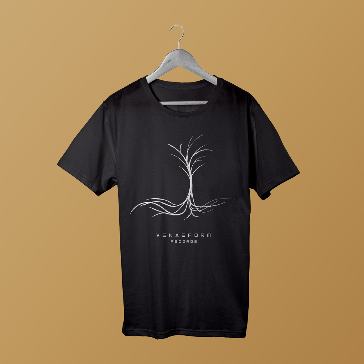
The Venaeform Records identity combines custom artwork, typography and graphic elements to create a dark and atmospheric visual language for the label.
The system was designed to provide a consistent foundation while allowing individual releases to develop their own visual character.
03\ ALBUM ARTWORK
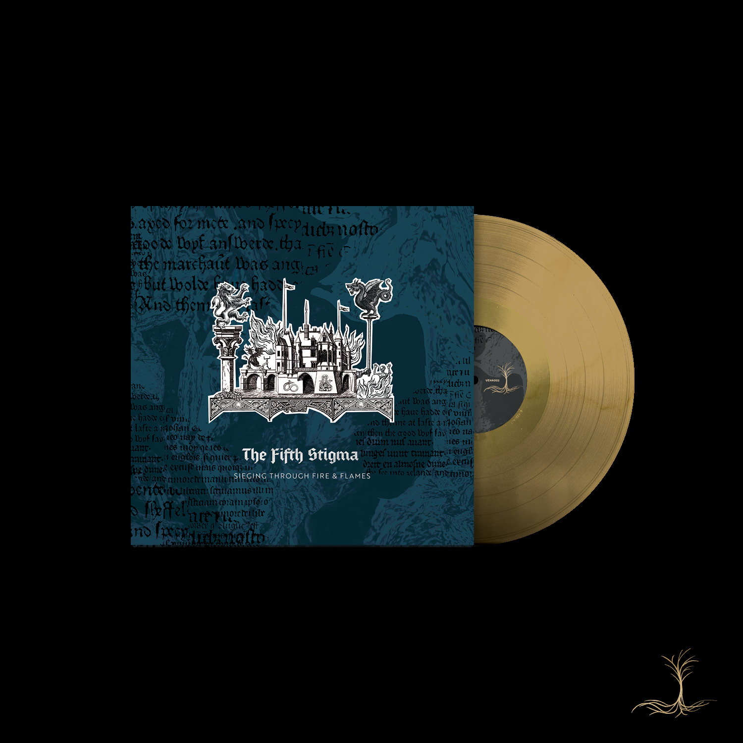
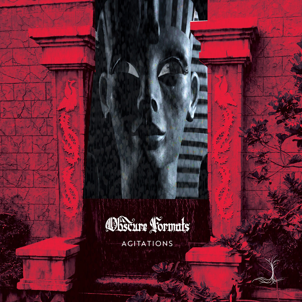
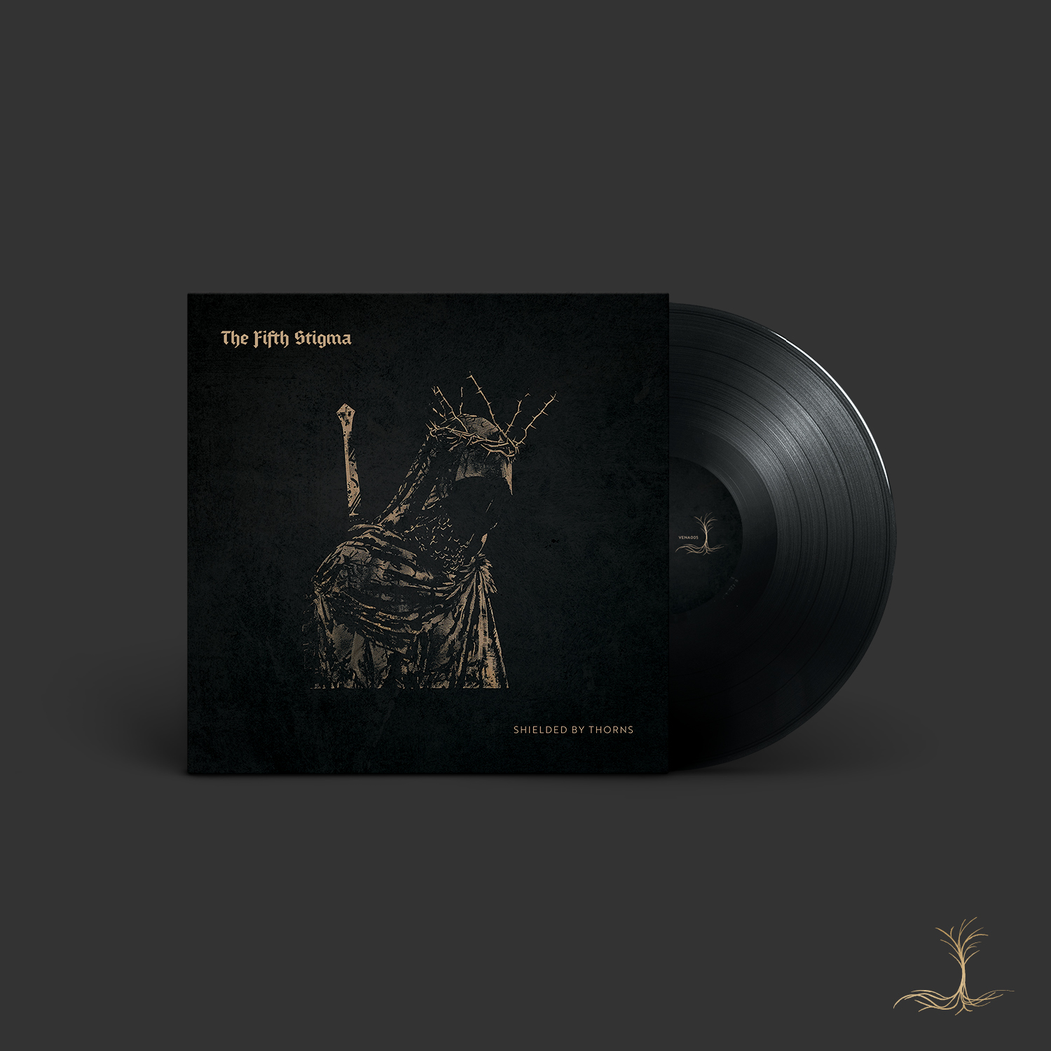
Original album artwork developed for Venaeform Records releases, using my own artwork as a core visual element.
The artwork was adapted across album covers and release graphics, creating a visual connection between the label identity and individual records.
04\ PRINT + PHYSICAL RELEASES
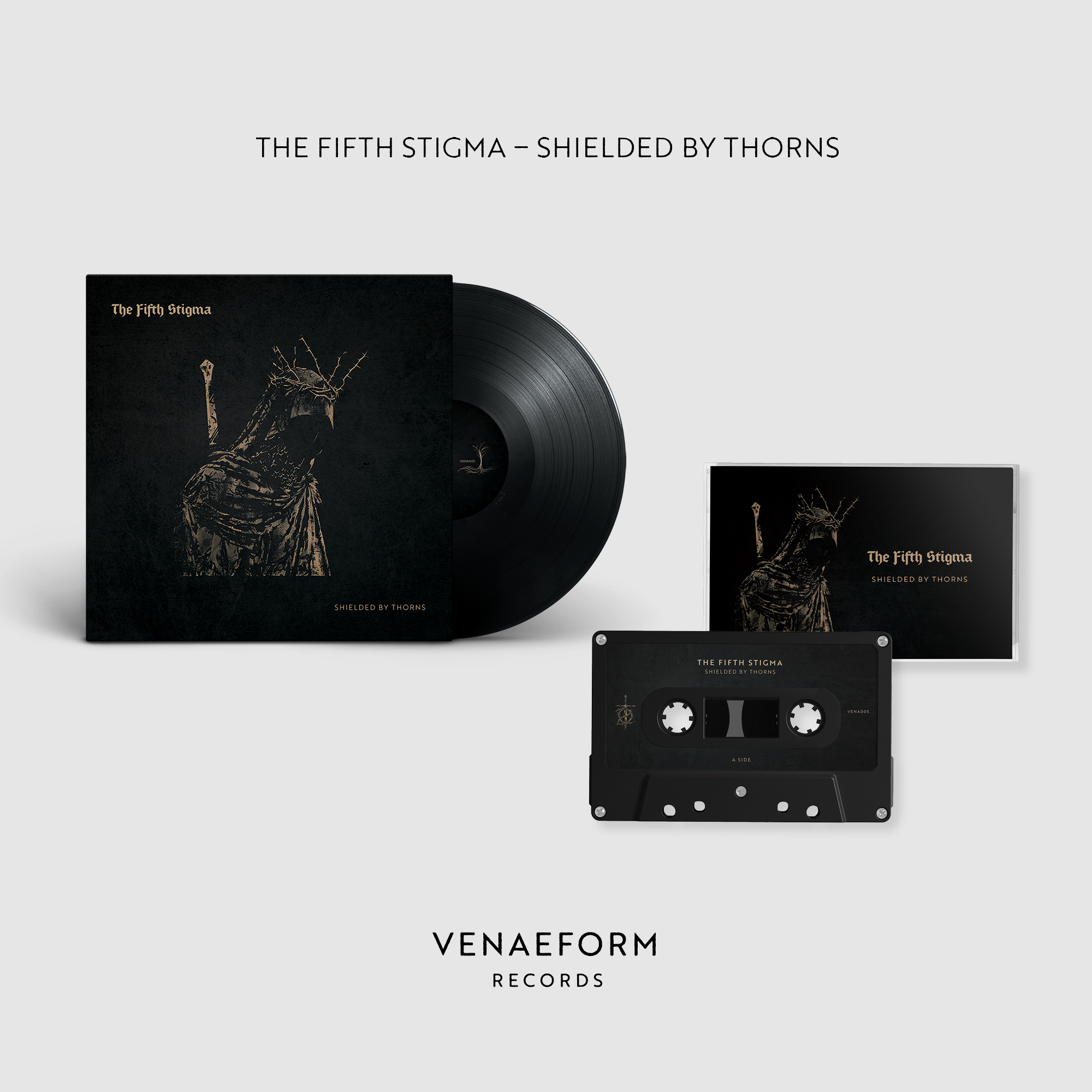
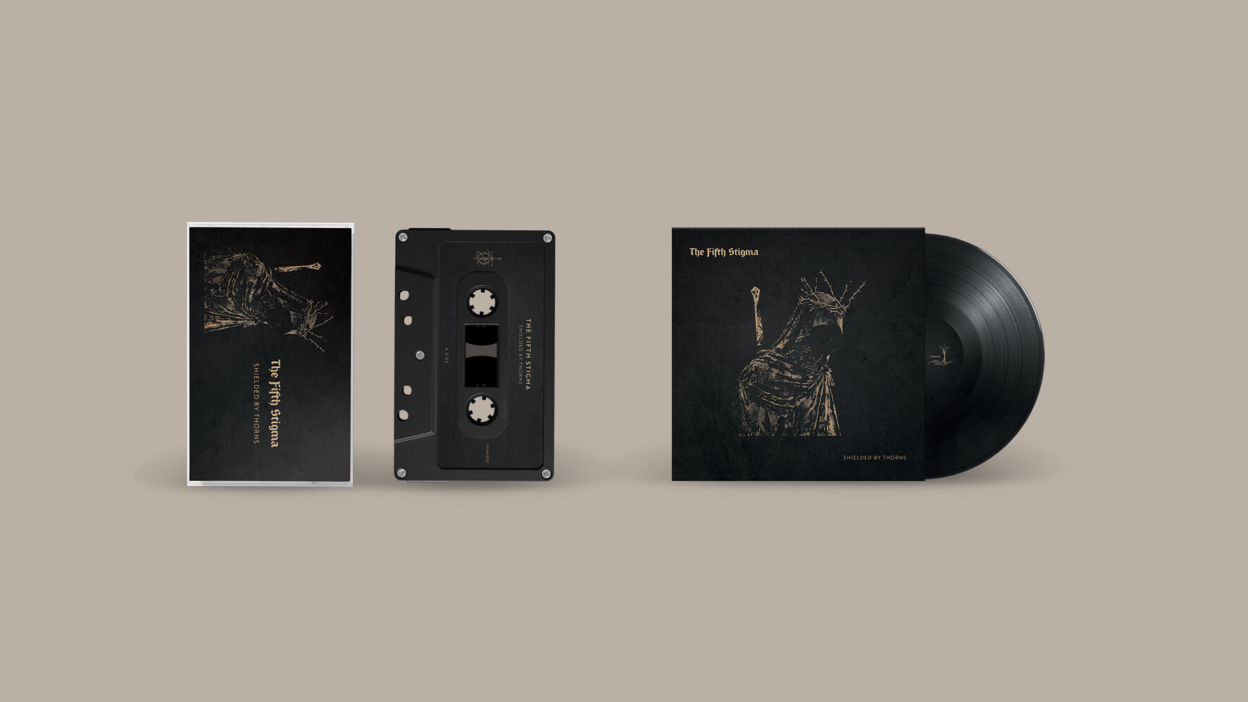
Print production for physical album releases, translating the Venaeform visual identity into finished materials for distribution.
The work included artwork preparation and production-ready design for the label’s physical releases.
05\ SOCIAL + RELEASE GRAPHICS
Social media graphics created to promote new Venaeform Records releases, extending the album artwork and label identity into digital campaigns.
Custom promotional assets were developed for individual releases while maintaining a cohesive visual language across the label’s social presence.
06\ ANIMATED RELEASE CONTENT
Animated social graphics created for Venaeform Records releases, bringing the artwork and visual identity into motion.
The animated assets were designed for digital promotion, adding movement and atmosphere to release campaigns while remaining connected to the static artwork.
07\ VISUAL IDENTITY ACROSS FORMATS
From the label identity and album artwork to physical releases, social graphics and animation, the Venaeform Records visual system was designed to move fluidly between formats.
The result is a flexible identity that gives the label a recognizable visual presence while leaving room for each release to have its own character.